No items found.
View PlansProduct is not available in this quantity.
A warm, inviting brand identity and custom website for Connie’s Comforts, bringing the heart of homemade baking to life.
Connie’s Comforts is a home-based bakery in Harrisonburg, Virginia, specializing in homemade baked goods crafted with care and a personal touch. With a vision to bring the warmth and nostalgia of home baking to its customers, the business needed a distinctive brand identity and professional online presence that would reflect its personality while supporting its growth.
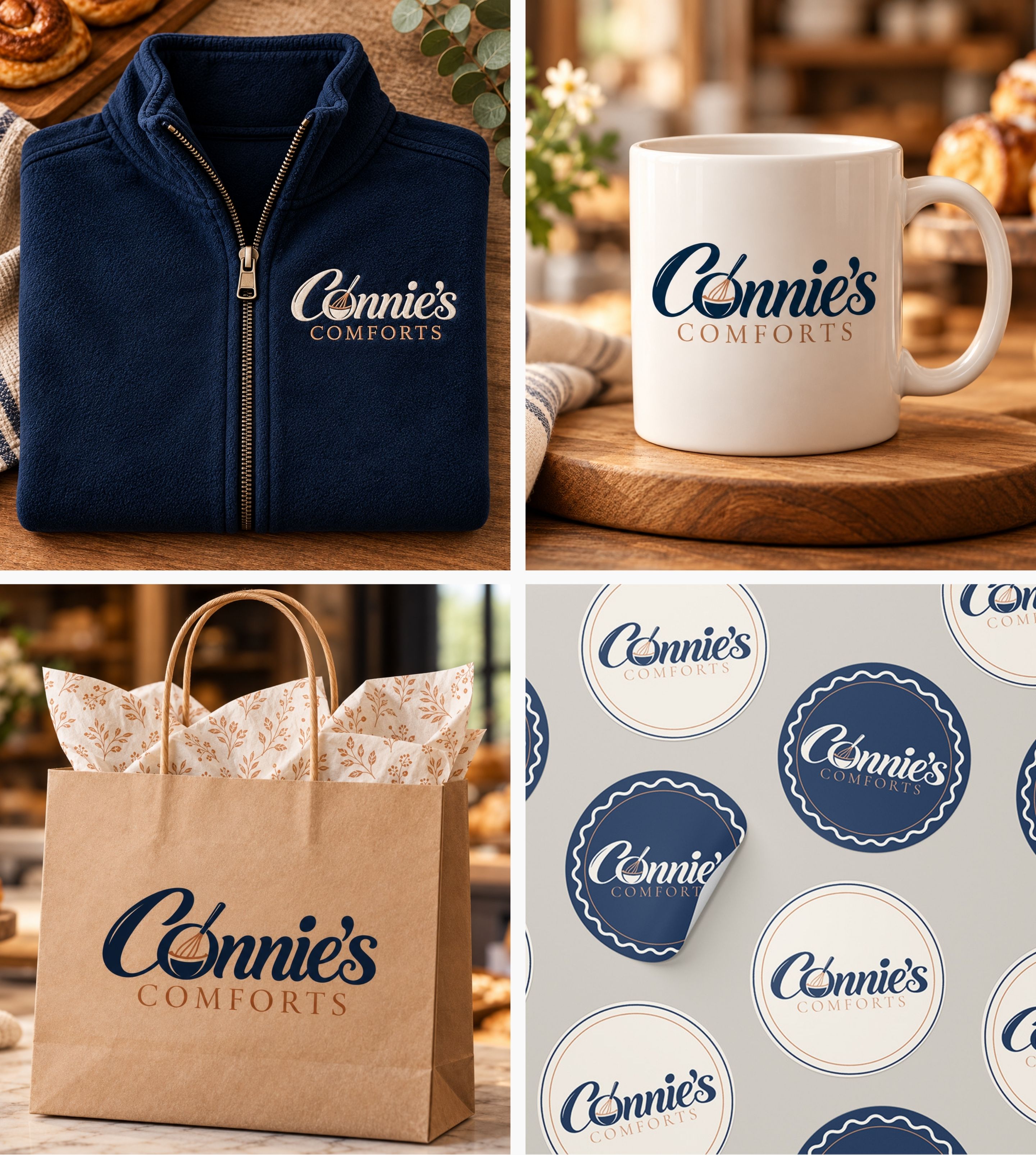
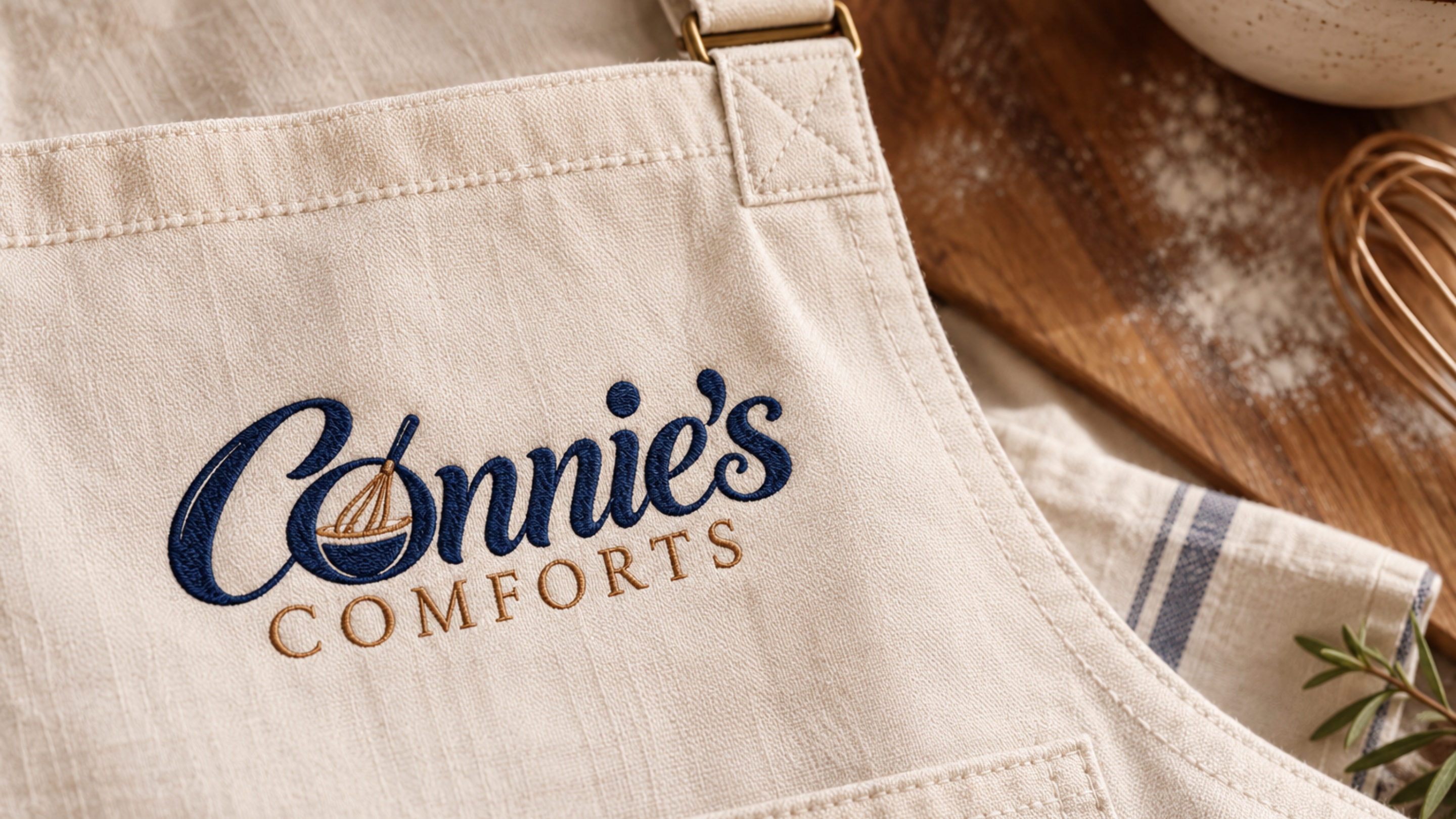
Novulty partnered with Connie’s Comforts to develop a cohesive brand identity and custom-designed website. From the distinctive CC monogram and thoughtfully selected typography to the warm color palette and branded packaging applications, each element was designed to communicate the bakery’s welcoming, handcrafted character.
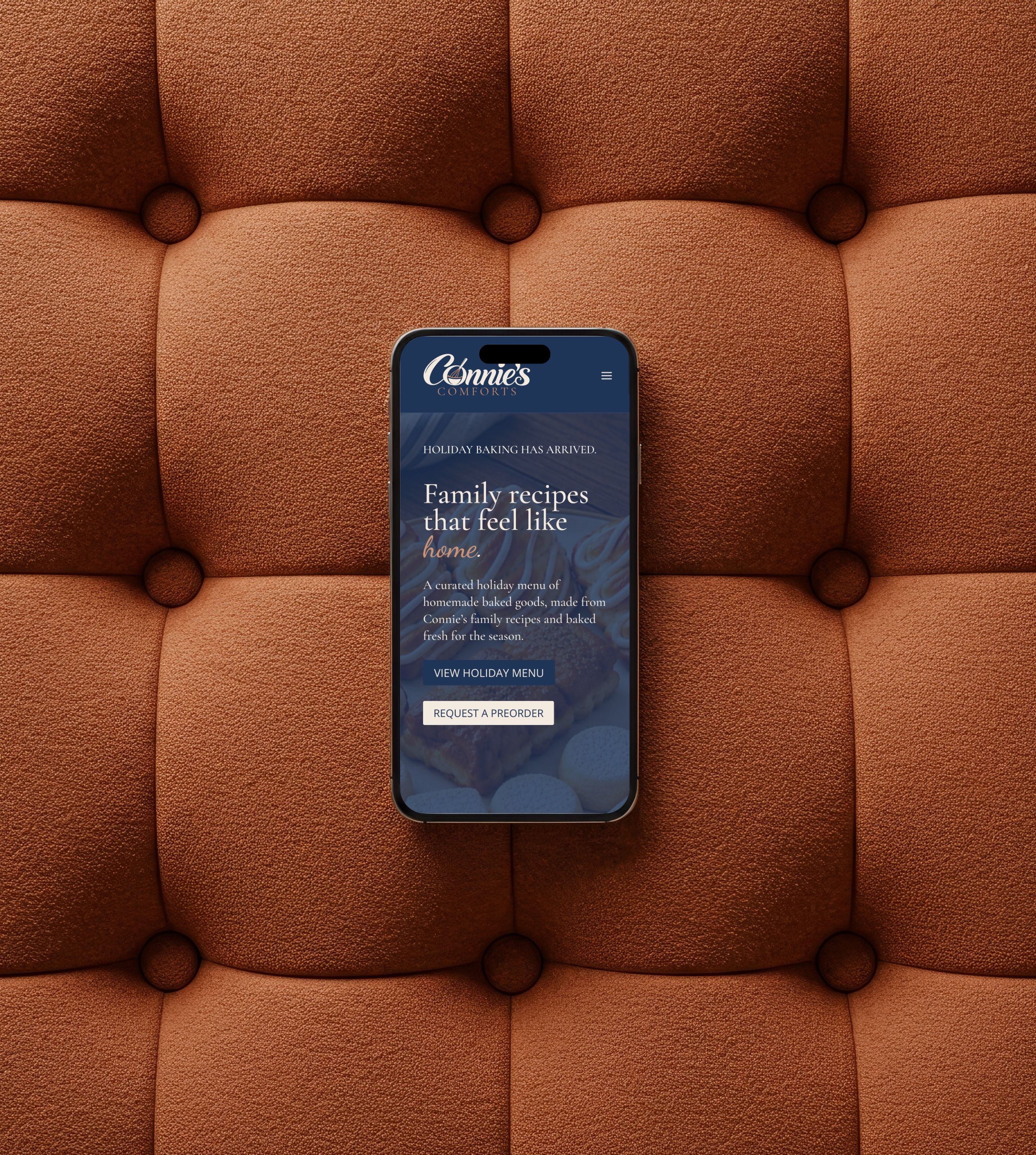
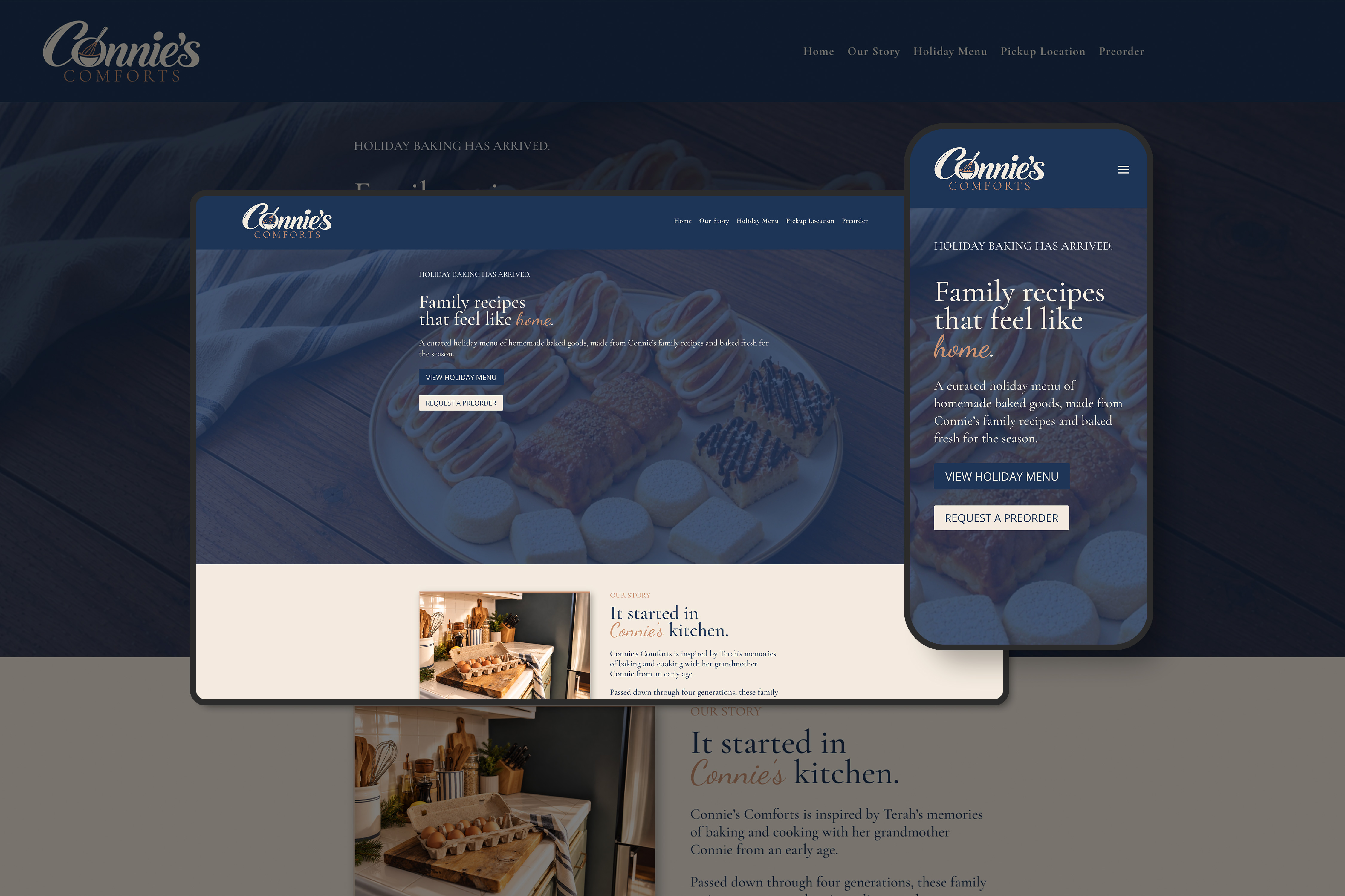
We extended that visual identity into a fully developed, responsive website, creating a consistent experience across the brand’s physical and digital touchpoints. The website introduces customers to Connie’s Comforts, showcases its baked goods, and provides a convenient way to place orders and access pickup information.
Together, the branding and website establish a recognizable, professional foundation for Connie’s Comforts as it builds its customer base and grows its presence in the Harrisonburg community.
For Connie’s Comforts, a home-based bakery in Harrisonburg, Virginia, the challenge was to create a brand identity that honored the family recipes and traditions behind the business while establishing a distinctive, professional presence in the local market.
The brand needed to communicate more than homemade baked goods. It needed to capture the personal connection, familiar traditions, and sense of home that make Connie’s recipes meaningful. The visual direction called for something nostalgic and welcoming, yet refined enough to feel timeless rather than overly rustic or dated.
Equally important was creating a flexible identity that could translate naturally across bakery packaging, labels, promotional materials, and digital platforms.
Alongside the brand identity, Connie’s Comforts needed a professional website that would introduce the business, showcase its baked goods, and provide customers with a convenient online ordering experience.
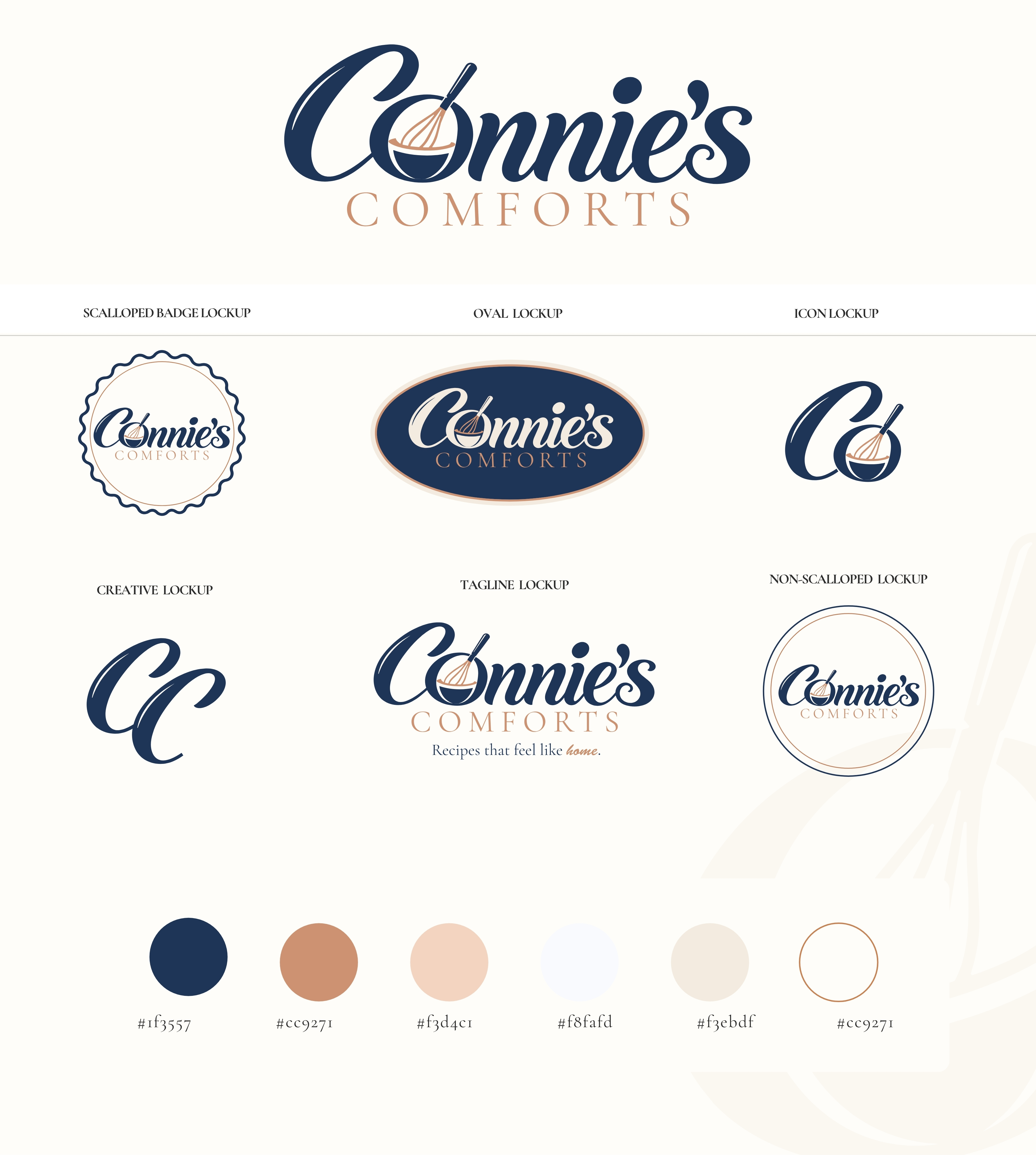
Our creative direction centered on three defining elements of Connie’s Comforts: Connie’s story, the tradition of baking, and the feeling of home. Rather than placing a conventional bakery illustration alongside the business name, we integrated the tools and traditions of baking directly into the identity. The custom mark brings together Connie’s name, a mixing bowl, and a whisk in one distinctive visual expression.
The mixing bowl became a meaningful symbol within the design. It represents the place where ingredients come together, recipes are prepared, and family traditions continue. The whisk reinforces the craft of baking while introducing movement and personality. Together, these elements tell a story that extends beyond the products themselves, connecting the identity to the recipes that began with Connie and continue to be prepared and shared today.
Typography played an important role in communicating the brand’s personality. The expressive script used for Connie’s draws inspiration from handwritten recipe cards, family notes, and recipes passed between generations. Its flowing character also reflects the hands-on movements of baking. We paired this lettering with the more structured typography of COMFORTS, creating a visual relationship between warmth and refinement.
The color palette follows the same direction. Deep navy establishes a timeless foundation, complemented by rose gold for warmth and a subtle handcrafted quality. Soft blush and neutral tones complete the palette, creating an inviting aesthetic inspired by natural linens, ceramic dishes, wooden tables, and familiar kitchen surroundings.
To support the brand across different applications, we developed a comprehensive logo system that offers flexibility without compromising its visual identity. The primary logo brings Connie’s name, the mixing bowl, and whisk together in one distinctive composition. From there, we expanded the system to include both scalloped and non-scalloped badge variations, giving the client options for different packaging styles, labels, stickers, and promotional materials.
The scalloped badge introduces an heirloom-inspired quality that complements the nostalgic character of the brand, while the non-scalloped badge offers a cleaner, more traditional presentation. We also developed a standalone C icon incorporating the bowl and whisk, along with a custom CC monogram that provides an additional recognizable brand signature. An alternate wordmark completes the system, offering a more understated option for applications where simplicity is preferred.
Each variation was thoughtfully designed to preserve the character of the original concept while allowing Connie’s Comforts to adapt its identity across physical and digital touch points. The tagline, “The recipes that feel like home,” reinforces the emotional connection behind the design, bringing together family, tradition, and the comfort of something made with care.
With the visual identity established, we extended the brand experience into a custom-designed, responsive website that reflects the same warmth and attention to detail. We incorporated the brand’s distinctive typography, color palette, and supporting visual elements throughout the website, creating a consistent connection between the online experience and the bakery’s physical presentation. The website was designed to introduce Connie’s Comforts to customers in Harrisonburg and surrounding communities, showcase its baked goods, and make the ordering process straightforward and accessible.
Clear product presentation, intuitive navigation, online ordering functionality, and pickup information help customers move comfortably from discovering the bakery to placing an order.
The completed project brings together a meaningful brand identity and a cohesive digital presence, giving Connie’s Comforts a recognizable foundation for connecting with its community. Every element, from the custom bowl-and-whisk mark to the handwritten typography, heirloom-inspired badge, packaging applications, and website, contributes to a consistent story. The result is an identity that feels personal, nostalgic, and refined, honoring the recipes and family traditions behind Connie’s Comforts while positioning the bakery for continued growth.